
Paint Consultations Add Expertise and Style
There’s no doubt that one of the most fun processes during a home renovation is choosing paint colors. Visualizing a space, grabbing swatches and watching a blank slate transform is both mesmerizing and satisfying.
However, it can also be overwhelming. With thousands upon thousands of options, the task is daunting to say the least.
Paint color consultations, with trained professionals, offers insight and takes the guesswork out of revamping your space.
“It can also help ensure colors flow well throughout a space and coordinate with existing finishes,” Tom Schoenfeld, Store Manager for the Neenah Sherwin-Williams, explains. “Ultimately, it gives you what you need to make a confident color choice and helps avoid repainting.”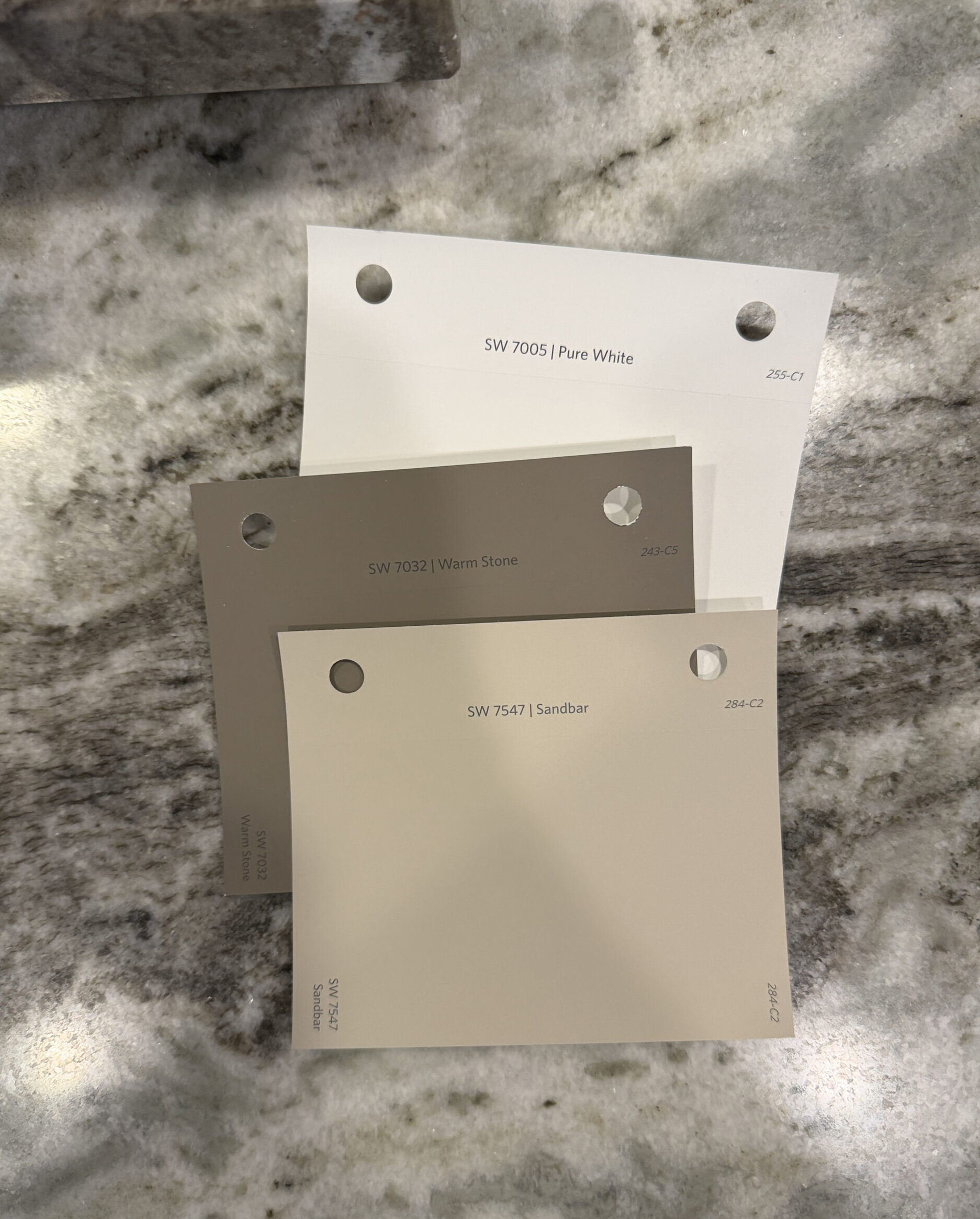
Color is one of the first things guests of your home or business notice, and that means getting the impression you want right out of the gate.
“There is an ‘art to getting it right,’” Ann Holz of Ann Holz Interiors Plus, adds. “Paint color consulting helps the client feel confident in the color choices they have made. For example, there are 1,000 shades of ‘white.’ A color consultant will help you narrow down the choices to help choose the best ‘white’ and confirm all of the reasons why that particular white works.
“Choosing paint colors is not easy and can cause some sleepless nights. I highly recommend using a color consultant to help ease your mind and show you the color options and then can also show you what one shade lighter/darker would look like.”
It’s all about choices, and complementing both natural light, architecture and purpose. Read on to discover the importance of a paint color consultation.
Why Consider a Paint Color Consultation
Like anything, the experts know best, and choosing paint colors to honor your personality and opinion while complementing the space is no exception. The color selection process combines color experts’ knowhow with personal preferences as well as what is appropriate for the style of your property.
While most people have a favorite color, that doesn’t necessarily mean it’s a good choice for your home. Each situation is unique and deserves personalized attention. While a certain paint color may look good in a magazine or a friend’s house, it may not be appropriate for the architecture or time period of your space.
Being intentional is a major part of doing it right, and that begins with revealing what it is you’re starting with and what you eventually want the impression of our space to be.
“I always start with a walkthrough and interviewing the client is a must,” Holz says. “Questions I ask:
1. What rooms or rooms will be painted? What are the adjacencies and do we have to coordinate any rooms that are previously painted (and will be seen from the room or rooms that will be newly painted with the new color(s)?
2. How much natural light?
3. What is the style?
4. What is the inspiration? Is there a design element and/or an existing piece of artwork, a rug, a pillow, or upholstery from which to pull colors from to start the color selection process?”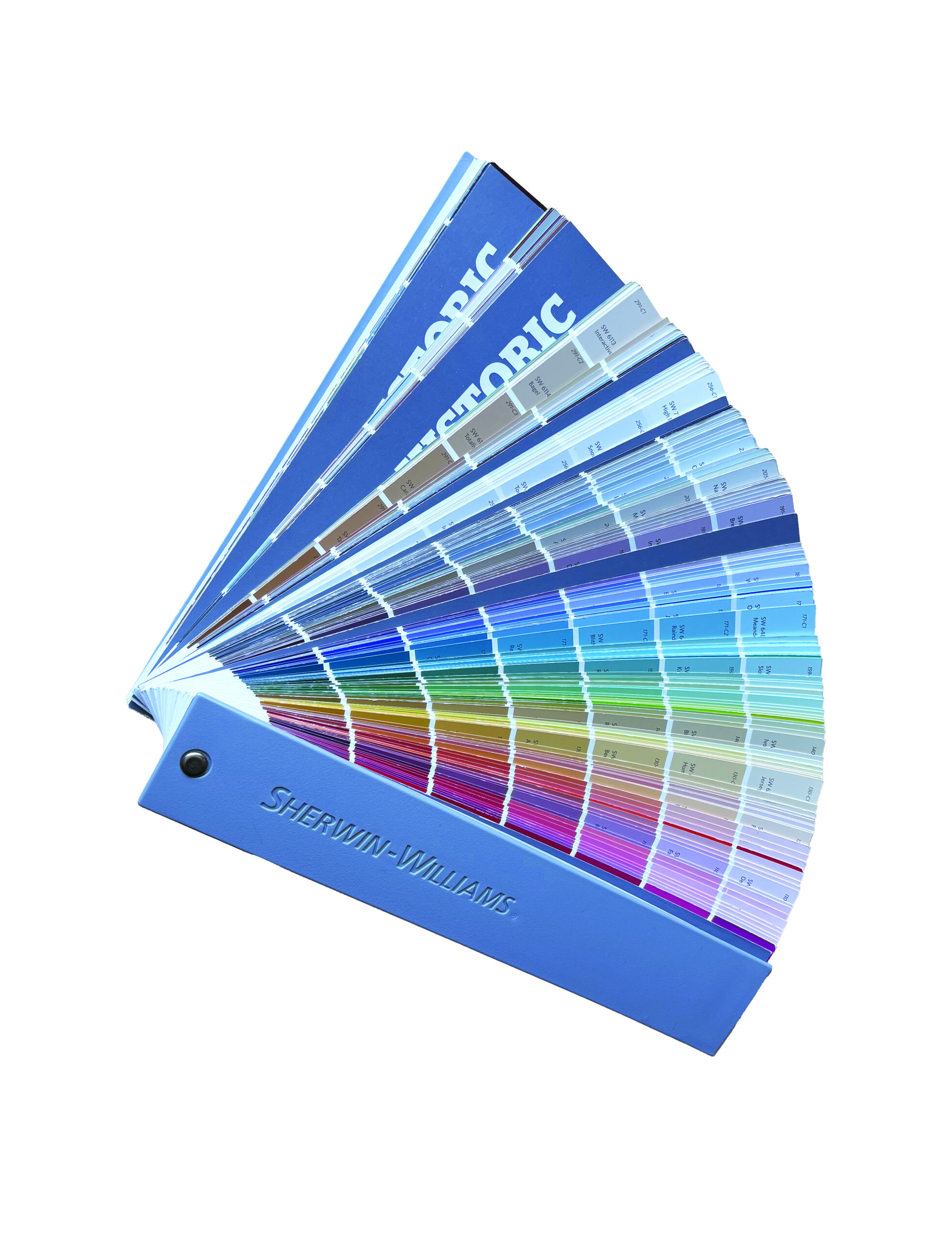
Sherwin-Williams offers a Color Services Program with support for any level of guidance you’re looking for.
“We don’t have a single ‘most popular’ tool as each serves a different need,” Schoenfeld says. “Free Live Color Chat for quick expert advice, free Email Color Consultations for personalized room palettes, and paid Virtual Color Consultations for larger, multi-room projects. The goal is to provide expert guidance at every stage, whether you’re selecting one paint color or creating a whole-home palette.
“When a customer chooses to have a color consultation with Sherwin-Williams, whether our Color Chat, email consultation, or a virtual color consultation appointment, you’re always talking with a real color expert. You can rest assured that you’re not speaking with an automated bot, but a real-life human. (With the exception of utilizing the Color Chat outside the listed hours on our website).”
After the initial interview/consultation, experts suggest looking at the big picture first, and slowly but surely adding complementing features.
“I always suggest finding the overall paint color first,” Holz says. “Then the accent colors get pulled next. My number one rule is to find out what the client likes for colors. I am not huge into trends. Trends change all of the time. My advice (is to) select a classic neutral and change out your accessories seasonally to get those ‘pops’ of color.”
Setting the Mood with Color
Whether we’re on to it or not, color psychology is real. It’s considered “the scientific study of how different hues and shades shape human mood, cognition and behavior.”
It’s happening all around us, and may affect us more than we realize. A well-known example, fast food restaurants tend to incorporate reds and yellows into their logos and designs as that has been shown to increase appetite.
“The right color can help set the tone for a space,” Schoenfield explains. “Soft blues, greens and warm neutrals are often chosen to create a calming, relaxing atmosphere, while deeper shades like navy, charcoal, and rich greens can add drama and create a more moody feel.
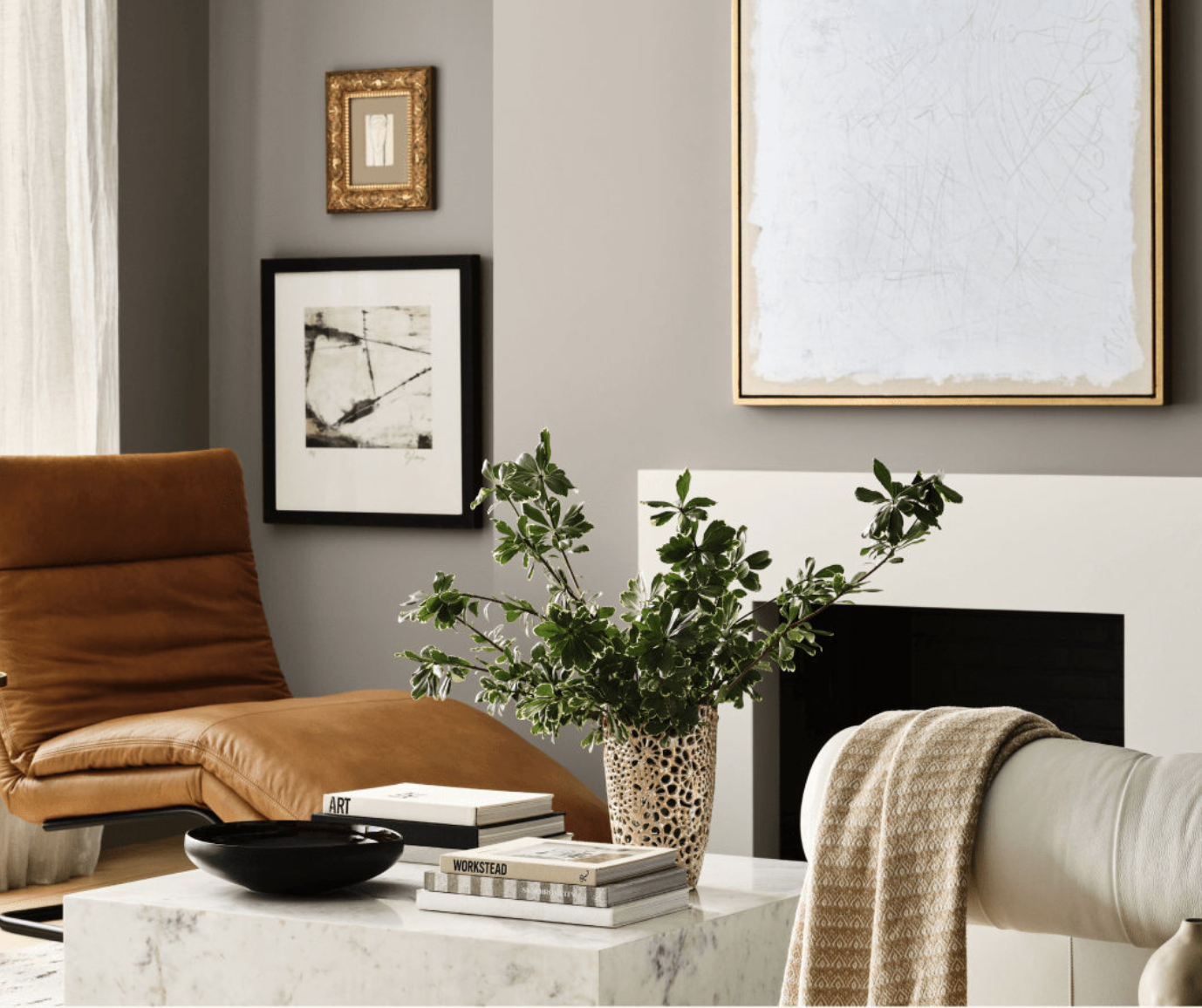
“For a professional or polished look, many homeowners gravitate toward clean whites, sophisticated grays and greige tones. Sherwin-Williams color experts can help homeowners select colors that align with the mood they want to achieve while complementing their home’s lighting, style, and existing finishes.”
“I prefer and tend to steer clients to warm neutrals, taupes and earth tones which tend to be more timeless,” Holz adds. “If you want to add color… calming and quiet spaces: soft blues and sage greens are great for bedrooms. Something fun, energized, clean and appetizing: oranges, yellows and white = kitchens.”
 “There are a few important considerations,” Schoenfeld agrees. “For interiors, lighting, room size and existing elements such as flooring, furnishings, and décor can all influence how a color appears and feels in a space.
“For exteriors, factors like natural light, architectural style, and fixed elements such as roofing, brick, or stone should be considered. There can also be technical limitations depending on the surface being painted. For example, some colors are not recommended for vinyl siding because they may absorb excessive heat.”
Sherwin-Williams’ yearly Colormix reviews all color trends we are seeing in the industry. For 2027 it’s called Rewild, 48 handpicked hues, featuring ten timeless and transcendent Continuity Colors.
“Rewild is a compilation of three design stories,” Schoenfield explains:
Revive: A reverence for the past, heritage revival, and craftsmanship. Colors evoke Americana, historic architecture, and timeless character.
Reignite: Bold, expressive, and emotionally charged palettes that reject restraint, embracing chromatic tension and tactile contrast.
Reconnect: A focus on nature, wellness, and environmental awareness, with biophilic design principles at the core.